The CW dishes out the sauce with new logo, branding

Subscribe to NewscastStudio for the latest news, project case studies and product announcements in broadcast technology, creative design and engineering delivered to your inbox.
Nexstar Media Group has unveiled an updated “saucy” logo and look for The CW.
The new design centers on a slightly refined “CW” logo, with the curvy strokes made a bit thicker and the space between vertical elements narrowed. The network also dropped the word “The” from the logo, though the article is still part of the network’s official name.
Chris Spadaccini, the chief marketing officer for the network, told Variety that the “The,” which used to live inside of the curve formed by the “C,” was removed mainly for legibility purposes. The word became too difficult to read at smaller sizes, which has become a common occurrence when it needs to appear on streaming and mobile platforms.
Spadaccini noted that the “The” is now implied in the network name, and Nexstar expects that, thanks to years of familiarity with the brand, the public will still call it by the “full” name.
Nexstar acquired a 75% majority of The CW in mid-2022 from Paramount Global and Warner Bros. Discovery, who still own 12.5% each.
Another reason behind removing “The” from the logo was that sub-brands, such as “CW Sports” and “CW Original,” don’t use the article — and in some cases, such as “The CW Original,” don’t exactly make sense.
It also dropped its longtime green color scheme in favor of a reddish-orange known as “CW hot sauce.”
CW worked with DixonBaxi on the redesign.
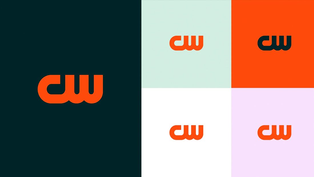
The network also introduced an updated color palette, including a dark background color with hints of blue and green. It’s definitely a sharp look with a touch of sophistication and almost feels like the color you’d expect an encyclopedia or other reference tome to be.
Contrasting with that elegance the palette is rounded out with a minty green, basic white and pink, the latter of which has begun popping up on streaming platforms, mobile devices and connected TVs in the form of a refreshed app icon. It’s also become the look of choice on social media.
Nexstar has opted to officially retire the “Dare to defy” tagline and Spadaccini, who told Variety he’s not a fan of taglines, doesn’t know if one will be used again.

If the orange-red color is The CW’s hot sauce, then its new motion language could be described as a slithering snake with a bit a of sass.
A linear element is being used extensively throughout the new look — a sort of hooked-like shape with a sense of horizontal elasticity that grows and shrinks and essentially represents the entire letter “C” with the far right of the “W.”
This is often starts out as the full logo — before the two middle verticals playfully shrink down as the element grows in width, with only the far right one remaining.

The animation is often purposefully used as both a way to grab and keep the eye as well as a tie-in to other on-screen movement. It’s also not restricted to always being the same width or even fully on-screen at the same time — with the extended horizontal line bleeding off screen at times.
In other cases, the “hook” is used as a sort of container for other on-screen elements, including smaller images or text.
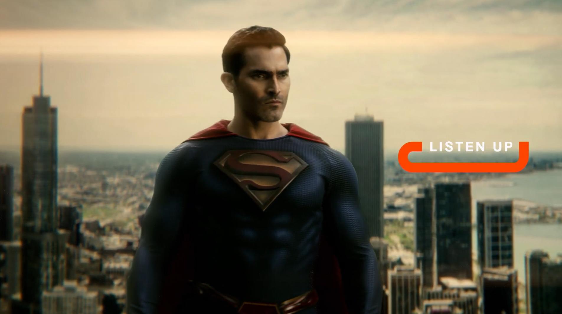
Promos typically feature an end bumper with the dark background color and the logo slinking on and off screen — often “shoving” other text along for the ride — before ultimately landing left-aligned and vertically centered. This look can also be used at the start of promos or, alternatively, the animation is largely retained but placed over fullscreen imagery.
There’s also a variation where text enters the screen from one side and ends up center aligned both horizontally and vertically before growing slightly for emphasis and then being replaced with a larger CW logo that also grows slightly in the brief time it’s shown.

Oversized repeating typography in a bold, clean sans serif is also used extensively throughout the sizzle the network released Jan. 12, 2024, ahead of the Critics’ Choice Awards telecast the network is carrying — a relatively big event for the decidedly lower profile network.
Individual show promos sport variety of takes on on-screen typography, including larger scale letters and fullscreens with type against colored backgrounds.
Keeping the logo relatively similar has the added advantage that affiliate stations will have some time to transition to the new logo. For what it’s worth, WCIU, one the network’s larger Nexstar or Mission Broadcasting-owned stations in Chicago, had not updated its promos or bugs to the new look as of Sunday, Jan. 14, 2023’s Critics’ Choice Awards airing.
Many of these stations brand as “The CW (Channel Number)” or with a city or region name in tow, such as “The CW 26” for WCIU.
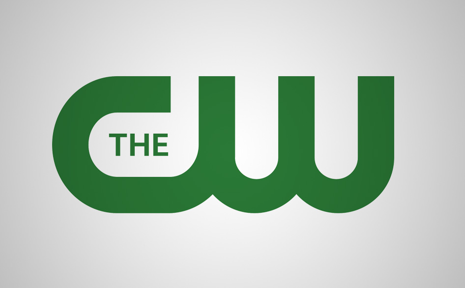
The original CW logo dates back to the network’s 2006 launch, though when originally announced, a different look was used.
Subscribe to NewscastStudio for the latest news, project case studies and product announcements in broadcast technology, creative design and engineering delivered to your inbox.


tags
DixonBaxi, Nexstar Media Group, The CW
categories
Branding, Broadcast Industry News, Graphics, Heroes, Network Branding, Networks