Popular TV graphics font Helvetica gets an update 35 years in the making

Subscribe to NewscastStudio for the latest news, project case studies and product announcements in broadcast technology, creative design and engineering delivered to your inbox.
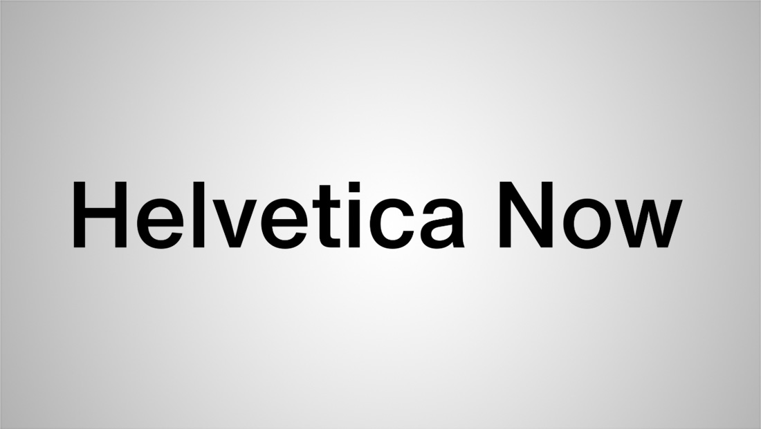
After 35 years since its last update — and 62 years since it was introduced — one of the most popular TV graphics fonts (as well as in graphic design in general) has gotten a major update.
Helvetica, which was updated in 1982 with Neue Helvetica (sometimes known as Helvetica Neue), is now available as “Helvetica Now.”
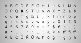
The new release, which required Monotype designers to redraw 40,000-plus characters over a four year period, includes across the board updates that aim to increase legibility at all sizes and media types.
#Helvetica gets a 21st century update https://t.co/0reiKNhQ6Y
— TypographicMix (@TypographicMix) April 10, 2019
Now included are Micro, Text and Display sizes, each of which have a variety of weights within them, ranging from thin to black.
TV graphics designers will benefit from the update with increased legibility thanks to characters that have been designed with screen display — as well as the traditional print — in mind.
In addition, smaller applications, such as tickers and mobile apps, could also benefit from the Micro size — which was developed specifically for use at smaller sizes.
Monotype has made the Helvetica Neue available for use on local computers as well as on websites that use webfont technology. Exact licensing requirements and pricing will vary greatly, though single-computer pricing starts at $35 for each font or $149 to the entire family.
It’s important to note that in order to use this (or any commercial font) on television broadcasting, you will likely need to purchase an extended or enterprise license that covers such use. Using the webfont on websites, meanwhile, is based on pageviews — with custom pricing packages available for high traffic sites.
Some large media outlets have commissioned their own, bespoke fonts, including CNN’s CNN Sans and BBC’s BBC Reith.
Although the prospect of designing a custom font is certainly not inexpensive, it may be seen as an opportunity to “own” the look of a font as part of an overall branding strategy, as well as potentially save money in the long term, depending on the licensing model negotiated.
CNN uses its font in almost every application — from on-air lower third graphics to its websites and mobile apps.
Subscribe to NewscastStudio for the latest news, project case studies and product announcements in broadcast technology, creative design and engineering delivered to your inbox.


tags
fonts, Helvetica
categories
Broadcast Design, Graphics, TV News Graphics Design, TV News Graphics Package, TV News Motion Graphics Design