Two Fox shows get new graphics

Subscribe to NewscastStudio for the latest news, project case studies and product announcements in broadcast technology, creative design and engineering delivered to your inbox.
Fox News‘ “The Ingraham Angle” debuted a new graphics package Dec. 6, 2021, following “Justice with Judge Jeanine” in getting an updated look back in November 2021.
The primetime opinion show hosted by Laura Ingraham dropped the silvery and blue graphics package it used since its debut in 2017, instead switching to a deeper look that moves the show’s title off two flat planes at 90 a degree angle to each other.

The old look used the show’s name as inspiration and placed “The Ingraham” and “Angle” at two different angles from each other, with the letters placed on the previously mentioned sides of an element. The graphics use Futura, the network’s primary typeface.
Now, the “angle” has been reimagined in vertical glass elements with pointed “tips.”
The background is now a deeper blue with gold accents and also includes some additional glassy floating elements.
Combined, the look has some similarities to graphics used throughout the much of CNBC’s schedule.
The show updated its stingers, bumps and reopen, along with segment stingers and animated backgrounds behind boxes. The “sliver,” as Fox refers to the branded band that appears on screen during most programs, has also been updated.
While bumps typically use a short pop of sound, the rejoins typically have a musical bed.
Ingram’s video wall background remained similar in tone, but added a repeating band of the show name that’s visible on most one shots. Her OTS graphic was switched to vertical glassy elements and bursts of light in favor of a “boxed” version of the blue and white look.
In the handoff between Sean Hannity and Ingraham, Ingraham announced that she had just be told about the new graphics package debut, although she noted she remembered hearing something about it in the past.
Hannity pointed out that could ask for “things like that” and then noted that “I like what I like” as the reason for not updating his much over the years, though he seem to suggest he might request a graphics update now that Ingraham got one.
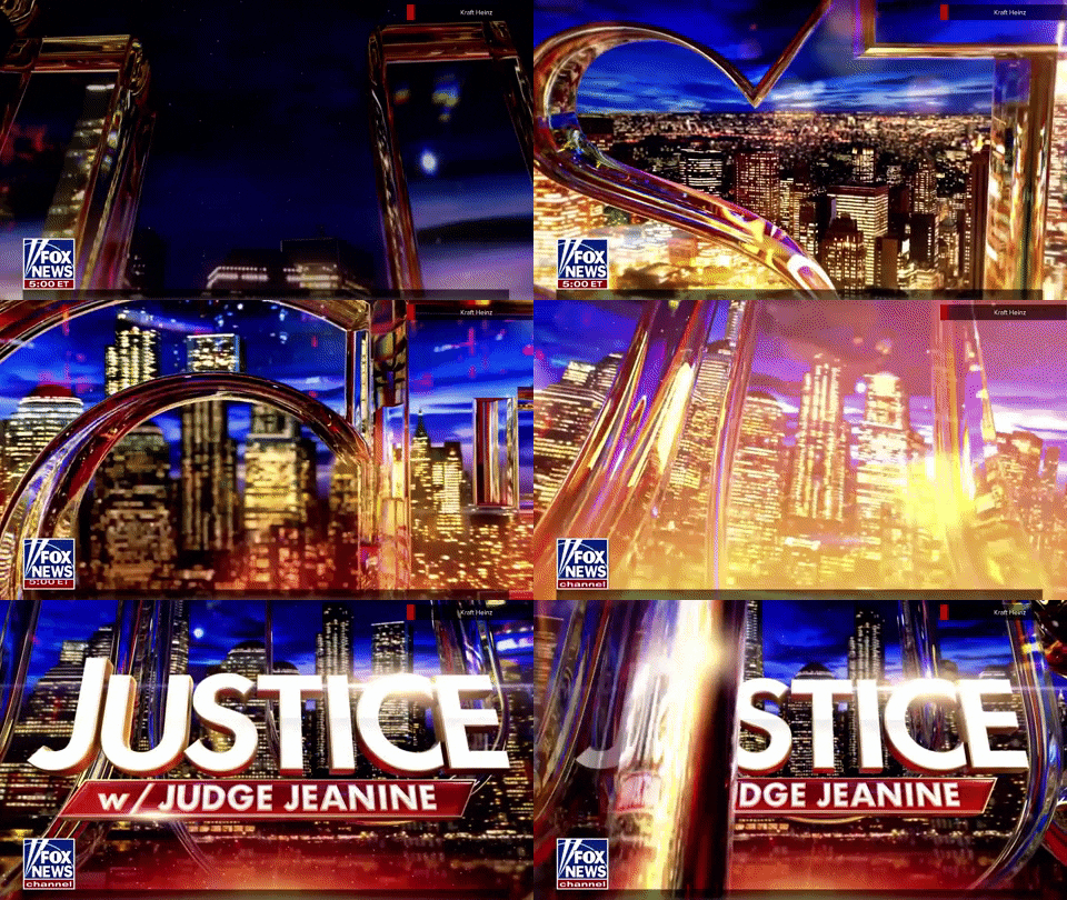
The redesign follows a Nov. 6, 2021, redo of “Justice with Judge Jeanine,” a weekend show hosted by conservative personality Jeanine Pirro.
Her old look consisted of a dark background with animated angled and triangle shapes.
The show’s title was shown with a beveled, metallic look that changed from blue to silver to red, depending on the angle of the digital “lights” in the scene.
Pirro’s new graphics follow the practice of styling the host name with a “w/” instead of the word.
Like Ingraham’s, the new look for “Justice” is highly glassy and features a blue and gold cityscape with a transparent, oversized version of the word “Justice” flying back the viewport before a solid version of the logo in white with gold sides animates in.

Under this is a red polygon that’s angled on the left and right that serves to house the host name, with the slash notable matching the degree of tilt.
The new logotype is in all caps (technically, the word “Justice” is actually in small caps) and uses Futura, the network’s primary typeface.
The oversized version of the title features distinctly and prominently rendered edges, which create a bold outline of the letter and service to “bend” whatever imagery is behind it. A vertical version of a glassy element that has a similar look is used as animated wipe throughout the show.
The new “Justice” look again has some similarities to CNBC looks and the oversized lettering conjures connections to the ones “The Suze Orman Show” once used.
For the sliver, the red polygon in the logo remains, following the entire (short) vertical space available to it. The slash touches the bottom of the sliver, but there is a small gap at the top, while “Justice” remains to the left outside of the box.
In some ways, the use of the angled red box and slash make the “Justice” look have a more “angular” design than “The Ingraham Angle” does.
Pirro’s video wall background has also been updated away from a waving American flag in favor of a looped version of the oversized lettering and cityscape look. Other on set graphics have been updated as well.
“Justice” originates from Studio J in New York since returning from an at home setup during the pandemic, with Pirro’s primary one shot using the video wall set into the alcove created, in part, by the catwalk, on one end of the space.
It’s worth noting that NBC’s “Saturday Night Live” made note of Pirro’s redesigned graphics and updated the opens and recreation of her set for skits in which Cecily Strong plays her earlier this season.
Subscribe to NewscastStudio for the latest news, project case studies and product announcements in broadcast technology, creative design and engineering delivered to your inbox.


tags
Fox News, Justice with Judge Jeanine, The Ingraham Angle
categories
Broadcast Design, Broadcast Industry News, Cable News, Featured, Graphics, TV News Graphics Design, TV News Graphics Package